
What Google's Separate Mobile Index Means for Tulsa Small Business
by Jonathan LeRoux
Small Business SEO, Web Design
September 14th, 2019
Last Thursday, October 13th, Google’s Webmaster Trends Analyst, Gary Illyes, dropped a major announcement: over the next few months, Google would be creating a separate document index for mobile content in order to provide better search results for mobile users.
However, the real news lies in what Google plans to do with the new mobile document index in relation to the current desktop index.
After the mobile-first index has reached a certain point of maturity, it will become the primary index for all Google searches and be updated first when new content hits the internet. It will also be updated more frequently when compared to the desktop index that will run alongside it.
With this change, Google’s sending out the clearest and loudest message that it can concerning the importance of mobile-first design:
“Hey! Everyone! We love mobile and the majority of the world loves mobile! Your website needs to look and function great for mobile users!”
In short, Google’s drawing a pretty clear line in the sand: if your website isn’t mobile-friendly, you’re simply not going to rank as well as a competitor who has taken the steps to design their website and content from a mobile-first perspective.
What Does the New Google Mobile Index Mean for Tulsa area Small Businesses?
This change will absolutely have a long-term and far-reaching impact on small businesses. This change clearly demonstrates Google’s stance on the importance of mobile-friendly websites: look great and provide a great mobile experience or get left behind.
-
All future and current websites and content must be designed from a mobile-first perspective.
Whether tweaking your site’s current pages, creating new content, or completely overhauling your business’s online presence, the first question that should be asked is “How will this look and function on a mobile device?”
-
Not being mobile-friendly is no longer an option.
If your small business’s website isn’t mobile-friendly, your competition is simply going to outrank you in Google search results. Google hasn’t been shy about their love for mobile-first design and the businesses that implement those design standards, nor about their rewarding mobile-friendly design with higher search engine ranking.
What Should Your Small Business Do in Preparation?
Thankfully, this change is happening in steps and over a period of months. Google’s first step is to roll out the index, then run both the mobile and desktop index side by side, and finally make the mobile index the primary Google search index.
Using this time to make sure your business’s website is mobile ready should be one of the highest priority items on your list. In our mobile world, not being mobile-friendly is killing your primary lead generator and your small business's first impression to the world.
How Can I Tell Whether or not my Small Business’s Website is Mobile Friendly?
Google, in an effort to help every webmaster ensure their site was delivering a mobile-friendly experience, released the Think with Google mobile-friendliness tester.
By simply submitting your website’s URL, the tool allows you to see almost exactly what Google sees when they crawl your site and makes helpful suggestions about how your site can be improved.
-
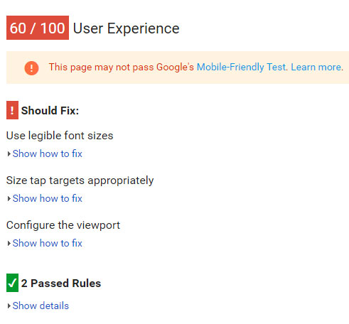
Overall mobile friendliness
You’ll see detailed information on how well your site delivers a quality mobile experience. Tap target sizes, viewport configurations, font sizing and more are analyzed to help you ensure your mobile visitors aren’t getting frustrated when interacting with your business.
-
Mobile speed performance
The tool will also provide insights concerning how quickly your site performs and serves its pages to people visiting on mobile devices.
Website speed is incredibly important, as nearly half of all your visitors won’t wait more than 3 seconds for a page to load. It’s also one of the key metrics that Google weighs when deciding where your content will rank when compared to your competitor's’ content.
-
Desktop speed performance
Lastly, your website’s desktop speed will be analyzed. This analysis includes how quickly your stylesheets (the code that makes websites look pretty) are being served, how fast your page’s Javascript is loading, and whether or not your images are optimized and loading quickly for your potential customers on desktop computers.
When using the tool, Google will provide you with a score as to how mobile-friendly your website is.
My Small Business’s Website isn’t Mobile-friendly. Now what?
You’ve run the page speed tool over your website, and you’ve found that your site is definitively unfriendly towards mobile visitors. Now what?
It’s in your best interest to move the issue of your website being mobile-unfriendly to the top of your to-do list.
“Oh, well, sure TurtlePie. I’ll just put this up there with the 43 other things that are at the top of my to-do list. Let me get right on that.”
We completely understand. As a small business owner, there’s a ton of things that take the slot of “A-list, 100%, full priority, Defcon 50” status, and that list never really seems to get any shorter.
But let’s flip the script for a moment.
You just got a call from your phone service provider. Starting right now, and throughout the foreseeable future, only 40-50% of your calls will come through to your business until you add a voicemail feature to capture missed calls.
When you ask why you need to provide that, the phone company responds that the majority of customers don’t want to wait endlessly for an answer and overall prefer a phone call experience that includes the option to leave a message.
It might be time-consuming and potentially incur an expense, but there’s little doubt that you and the majority of small business owners would expend the effort to ensure they were delivering their customers the best experience and not missing any incoming calls.
In the same way you’d be missing out on your phone calls, you’re missing out on business by not having a website that’s focused on delivering an easy-to-use mobile experience.
So, what are your next best steps to ensuring you’re meeting the needs of your mobile visitors?
-
As soon as possible, set up a meeting with your website design team and content producers.
Now, we’re fully aware that you may wear the hats of both “web design team” and “content producer.”
Whether or not you’re going it alone, or if you have staff dedicated to handling the website, cover what you’ve learned from the mobile-friendliness testing tool in your meeting.
-
Have your team get back to you with a detailed mobile performance report.
The mobile friendliness testing tool is actually driven by an older testing tool that Google developed some years ago: Google Pagespeed Insights.
Using this tool on your homepage and each individual page will allow your team to see what needs to be fixed at a much more granular level.
You’ll see exactly what’s slowing down your website’s performance, where you’re missing the mark in terms of mobile friendliness, and how you can start fixing these issues.
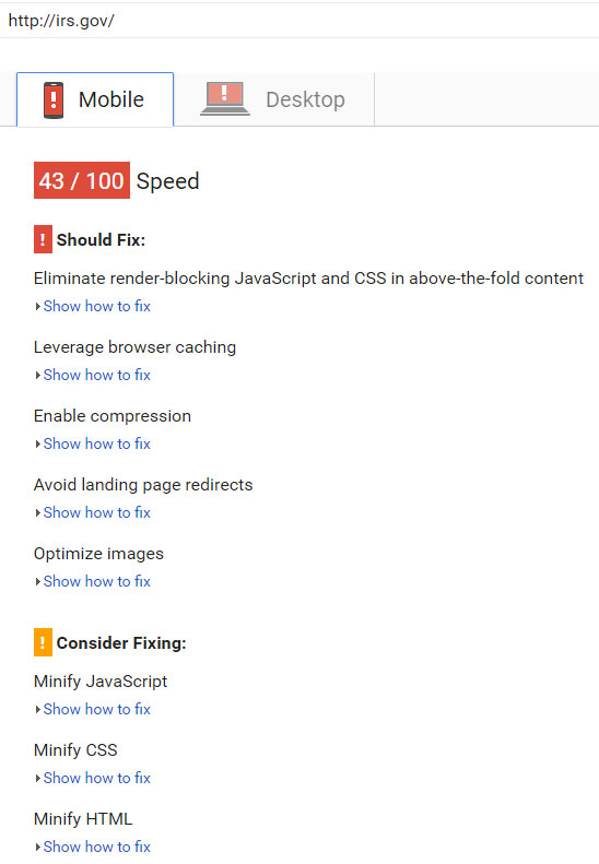
Looks like the IRS website could do better. (Does this count as auditing the IRS?) -
Establish a test-driven system of development that focuses heavily on mobile-first design.
From now on, everything you publish on your website needs to be designed, first and foremost, with mobile users in mind.
If you’re going at this alone, your best bet may be a responsive theme, should your site rest upon the Wordpress, Joomla, Wix, Duda, or other template-based web publishing architecture. Responsive themes automatically ensure your published content and web pages are mobile friendly.
If you have a team behind your small business’s website, we would recommend Ivan Shubin’s article on Visual Test-Driven Development for Responsive Interface Design — a great primer on how to get started with test-driven responsive design.
What’s Been Your Experience?
What has your Tulsa area small business been doing to better serve your mobile visitors? What difficulties have you encountered and how have you resolved them?
Our community would love to hear what challenges you’ve faced and how you’ve overcome them when delivering a better experience for mobile customers!
Join Our Community!
Follow @myturtlepie